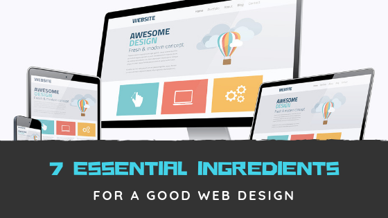
Web designing can be a difficult task at times because it involves creating a design which is attractive, informative, pleasing, builds brand reputation and technically sound. Web designing is not a very popular subject and is still considered a side subject in many designing institutes.
Most of the web designers these days are self-taught. While making a web design you have to keep a lot of things in mind such as the users who would be using the website, what will the website be about and so on. We are here to tell you about the essential ingredients that will help you to make good web design for your website.
Here are seven essential ingredients for a good web design
Know your users – One should always keep in mind that the website he/she is creating is not for themselves but for the people who would be using the website and visiting it to obtain some information or service. They should always recognize the user’s age and education level so that they can design their website accordingly. Knowing your customer will help you anticipate their wants and requirements which will further help you to meet their expectations.
Design should be attractive yet straightforward – Most of the users don’t read the website; instead they scan the website. Users are impatient and follow their intuition based on their behavior, and they appreciate good quality websites. Although users will visit your website for the information, it holds rather than design, but still, the design should be user-friendly and straightforward to make it convenient for the user to use. You can always refer to some websites like Ministry Website Designs offer you a different type of website templates.
Decide the objective of your website – A website can be the best salesperson for a business. So even before beginning with the design process, one should be clear as to what his/her website will be about. Many websites are too broad and lack specific focus. There should be three types of an objective for any website :
- Create awareness
- Conversions
- Generate more leads
Never make users wait – whenever a user visits a website he/she takes 3-5 seconds to decide whether they will explore further on the same website or not. It is essential to highlight the critical purpose of the website straight away so that they don’t take much time to search or check whether the information on the website is relevant or not.
Content is the king – Just like a storyteller connects with the listeners emotionally, the website should connect to its users in such a way that they should feel connected to the website or brand, and keeping relevant information in the website will help you connect with the user in a better way. Quality content will help the user find what they were looking for.
Font style and size – Good and relevant content is of utmost importance, but the way it is presented is also fundamental as it decides whether the user will read it or not. Font size determines the readability of the content. The font size should be above 14 pixels as it will make it easier for the user to read it on any device. Font size should be easy to understand and should sync with your brand to make it more relevant.
Color scheme – Choosing the right color scheme for your website is one of the most crucial steps. The color scheme can make your website more attractive and soothing to your customer’s eyes.
Conclusion –
You should always keep these points in mind while designing your website. Once the website is completed, you should always test your website. This will make sure that your website is free of glitches which can at times turn off a visitor. I hope these tips will help you in designing your website.

