As a matter of fact, not everyone can be a connoisseur when we talk about creating presentations that are really good. From good, it means that the presentation should be really engaging and convincing. Now, without any much insights, the task can be pretty challenging. From generating the interest in an audience to actually taking care of the initial branding, a dedicated PowerPoint presentation plays a crucial role. In this article, we will learn about how you can actually leverage the art of making presentations via PowerPoint templates.
1. Keeping a Check On Text
When you overburden your presentation with text, you simply kill your presentation from the very first slide. It’s human nature, your audience would prefer relevant graphics over text any day. Despite that, if you again end-up presenting a ton of text which they can’t digest, they will simply get bored and won’t take much part in the discussion. Also, it doesn’t mean that you just include the images and videos in your presentation and totally eliminates the text.
Try to balance the text by the likes of relevant infographics, diagrams and shapes. SlideModel.com is a reliable carrier for your presentation graphic support and Professional PowerPoint templates. In this website you can find thousands of editable graphics for your presentations.
2. Choosing PowerPoint Templates Over Ordinary Themes
It would be wise to mention that a presentation template can fill the void by becoming an essential component of each and every professional PowerPoint template. Consistency in a presentation is what is required to be achieved. In simpler terms, when you make use of multiple ordinary themes, your audience can’t really connect with your style. PowerPoint templates are thoroughly tailored as per the occasion and they encompass consistent & appealing design throughout the presentation. Make use of fonts, colors and styles in a concise manner.
3. Using Animations Wisely

Animations are great for your presentation, no doubt in that. However, one of the best practices that is advised while using animations in presentations is to keep it simple. Where PowerPoint by default offers an array of options like animating pictures, slides, shapes, voice and more. They can also distract your audience or might break their concentration. Further, this can also make your presentation look non-professional by various means. You should understand what your audience is looking at and paying a close attention to the eye flow is always advised. Subtle animations can make a strong difference while presenting, check some of the animated PowerPoint templates available if you want to get some inspiration. You can also consider including an animated explainer video in your presentation as well to leave a much better impact.
4. Keeping It Simple Yet Intuitive
When you go on that stage with your presentation at the back, you should understand that people are present there just to wear what you have to say. In a nutshell, PowerPoint presentations for business were originated to display ordinary and analytical data to the audience in an engaging manner. Those slides you made with the help of PowerPoint templates are just there to display facts and support whatever you’re speaking. A simple presentation with a consistent design, less number of slides, balanced text and images can do the trick. Here, while working with presentations, the KISS principle also applies.
5. Graphics Are Crucial
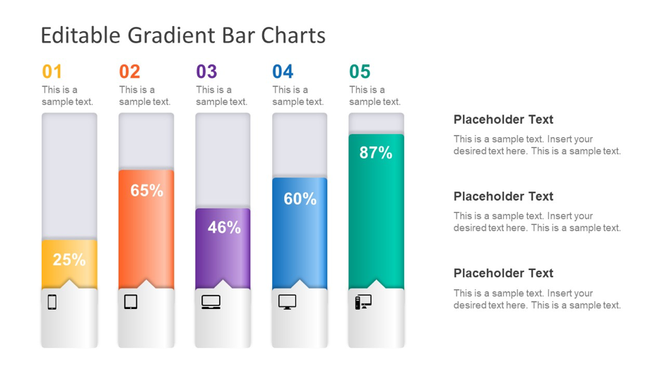
The last thing you would want to make your presentation is not appealing just because you misused the graphics. It’s highly advised to make use of graphics when it comes to illustrating relative amounts. When you overburden your audience with numbers and text, you simply make your listeners to do mental mathematics. Graphics should be utilized to make a presentation simple rather than making it complex. For instance, if you’re projecting some slide which contains multiple elements, a graph can be the best option in hand to communicate. At times, it’s cumbersome for the audience to digest complicated graphics.
6. Charts & Tables

As a thumb rule, when you present some facts and figures and back them up with corresponding charts and tables in your presentation, you simply make your presentation stronger as well as impactful. What comes as a noting fact is that apart from providing a great visual appeal to your presentation, charts and tables can also impart business-info to your potential audience in a pretty arranged manner. You can try breaking complex charts and tables into chunks and then relate them to each other.
7. Finding The Best Color Scheme

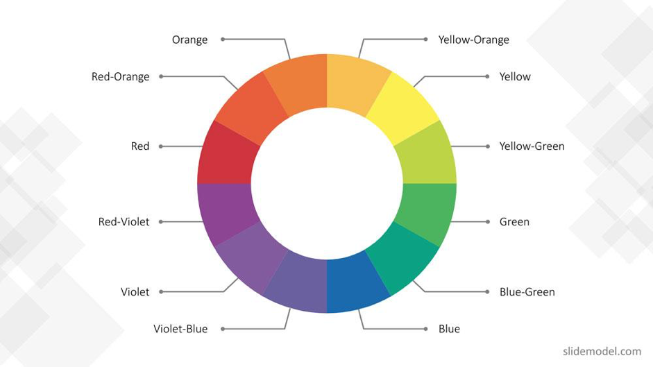
When you start making a presentation, the prime step you should consider is to find the best color combination for your presentation slides. An array of organizations today would prefer making use of templates with corporate colors in lieu of branding initiative. You should carefully understand components such as contrast and emotional meaning of colors. Further, one should avoid a color scheme that is hard to read. Even a non-experienced used can make a great presentation with the help of templates that provide a consistent color scheme, so you don’t have to worry.
8. Reflect Your Message
What you’re actually trying to say with your PowerPoint presentation should fit with the message you deliver. Presentation styles can differ when we talk about straightforward to corporate presentations. You should try to match your design aesthetic, it’s highly advised to make use of only relevant colors and fonts that suit your brand style. It’s often not easy to see past the color and font choices we make, you should try to customize the template till you actually like it.
Always remember that the PowerPoint presentation you’re making can reflect a lot about you as well as the brand you represent. Thus, if you’re looking forward to pitching a great idea in a presentation, the above-mentioned tips can result in a win-win for you.

