Your landing web page design is one of the key factors that will determine if your website will be successful and attract enough traffic. Though, the reality is that there are still far too many companies that fail to design a great landing page. As a result of their slapdash web page design, their bounce rates increase, while their conversion rates plummet.
In short, your company’s landing page is the very first page that your potential customers will see whenever they browse your website. If you view it like that, all your different web pages act like a landing page and its web page design should create great first impressions.
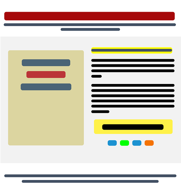
Now in order for your website’s landing page to stand out, it needs to boast four key features. There needs to be a catchy heading, descriptive subheading, call-to-action prompt and some sort of visual element. You can also have a look at some landing page layouts to get a clear picture of how to design one.
Headings
A perfected pitch remains one of the most important components of successful web page design today. Your heading and subheading should really speak to your potential customers by explaining to them the services or products that your business offers.
Use your heading and subheading to convince your target audience how your business can in fact help them. Your visitors should feel closer to your business after they have read your heading. After all, most of the time your visitors will actually know very little about your business and its offerings.
For example, your heading could pose a question to your visitors. Though, steer clear of including any technical jargon that visitors will have a hard time understanding or overwhelming them with too many keywords.
Visual Elements
Web page design that includes videos is currently a big trend! With the help of a video or other supporting visual you can actually show to them how your product or service works.
What make videos such a great tool to embed in your web page design is that they are dynamic, convenient and adds that much-needed personal touch that visitors appreciate. Visitors can simply click on the play button and see for themselves what your business has to offer instead of having to read large chunks of text. In just 10 seconds your video can convey more than an entire page of text!
However, if your business cannot afford to create a video, there is nothing wrong with simply sticking with images. If your business is going this route instead, try to select images that serve as representations of the type of person your target audience strives to be. This way your images can be just as effective as a fancy video.
Call-to-action Buttons
Your pitch and visual elements will be ineffective when your web page design does not have a clear call-to-action button somewhere on your landing page (just one will do the job – more than one and you will just end up confusing your potential customers). They are even more important on your landing page as the main goal of your website’s landing page is to get your visitors to take the next step so that you can boost your website’s traffic and conversion rates.
An enquiry form and a request to subscribe to your website’s blog are just two examples of common call-to-action prompts that you can include in your web page design. They might serve different purposes, but they need to stand out. You want your web page design to grab attention, though it should not be so striking that it is impossible for your visitors to ignore.
So, it is best to avoid big fonts and going crazy with the highlighting. Make sure that you place your call-to-action button in an area that does not have any distractions and add some contrast. Simply by doing this, your call-to-action button is sure to receive just the right amount of attention.
Other Considerations
In addition to these four key features, there are some other things that your design team should also give some thought to such as formatting and the use of colour. Ultimately you want your landing page to portray your business in a professional light. The easiest way to achieve this is by applying the font size consistently.
Though, you can relax as you can still have some fun by adding a dash of colour. Contrasting colour schemes can in fact be used effectively to let separate sections of your web page design stand out. As long as you apply colour wisely, you can (and should) use some colour to ensure one sleek-looking landing page.
Related Article: “The Heart of a Small Business is its Website Traffic: 5 Reasons Why”