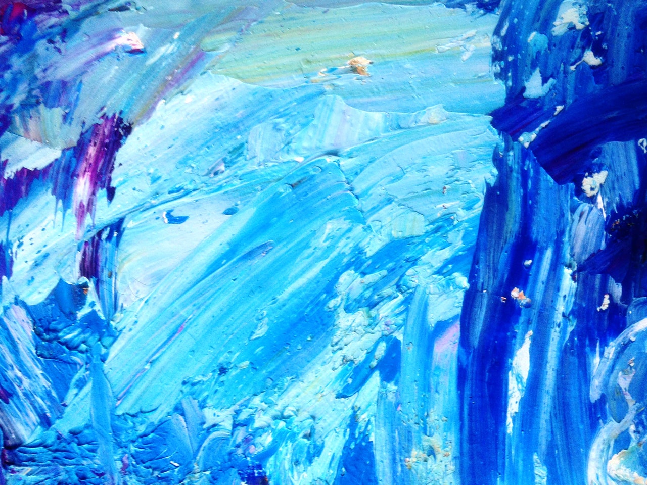
Abstract backgrounds are extremely used for highlighting the values of images in any design. In the world of designs, the use of the right color combination matters a lot and it is equally important for a designer to use an appropriate color in the background to convey the message in an image. Every color has significance and it increases a lot when it comes to abstract photos. It is important on the part of every designer to select the right background to make the art visually appealing to the viewers.
There are plenty of factors that we need to take into consideration while selecting the right color for the abstract background. It depends on the message you want to convey through the image. Since there is no explicit subject in the case of an abstract image, it becomes highly important to do justice to the color combination in an abstract background. Here are the following factors that one should consider while using the blue color in abstract backgrounds. After reading about the below-mentioned factors, the decision to use the blue color should be taken as per the requirements of a given image.
Peaceful Message
If an abstract image wants to display a peaceful or a sad message then blue color can be used in the background. This simply helps to elaborate on the idea of an image in a clear manner. While designing an image for a wedding, business card, or any other special occasion, care should be taken to take into consideration the theme of an image. In case, a person wants to depict some peaceful or sad message then the abstract image with a blue background will do the job quite satisfactorily. Blue abstract background helps to increase the focus of a person which helps a viewer to understand the message in a given abstract form in a less interval of time.
Color Combination
Color combination also helps to figure out the right color for an image in the background. Different colors have a different effect on human emotions and they play a crucial role in changing the mood of a person for good or bad. The colors in combination with the blue abstract background should be green, yellow, brown, etc for better effect. Many interior designers and graphic designers take special care of color combinations to give the right effect to the eyes of viewers. It is the right understanding of the color combination in abstract images which enjoys huge importance to obtain feasible results for viewers.
Calming Effect
Blue color falls in the category of cool colors and it is effective in giving a calming as well as a soothing effect on a human mind. Even it is used with purple color to make an image a little more creative. For the websites related to health, security, or beauty, it is better to go for blue color in abstract backgrounds. In the case of abstract vector graphics, people should use it to make it all the more appealing to the viewers and to give a calming effect to their eyes as well as their minds.
Business Cards
It is noted in many studies that blue abstract background helps to make a business card more attractive and it contributes to the growth of a business by attracting more people towards the products as well as services of the company. Many company owners have also admitted this fact as they have witnessed a huge growth of business in the online world as well as the offline environment. When a person gives a business card to another person, then the blue color in the background appeals to a receiver on a large scale which eventually converts a receiver into a client for a business.
Other Factors
Apart from the factors mentioned above, there are plenty of other factors that one should take into consideration while choosing a blue abstract background in images of different relevance. And these factors are gradient, shape overlay, border, and opacity, as these four factors contribute to increasing the value of a given image. Moreover, it also matters a lot on the choice of an individual in selecting the blue abstract background for images to be used for different purposes in the world of graphics.
So, these are some of the factors which one should consider while choosing a blue abstract background in invitation cards, wedding cards, and business cards. The blue color looks attractive to eyes and it impacts the emotions of a person to a great extent. In Abstract art, there is no subject and only effective designs are used to appeal to viewers in order to convey the message. In abstract images, the visual language of shape, color, and the line, is used to form a composition and to communicate the message visually to people.