
Did you know that, on average, you only have about 15 seconds with a website viewer before they leave your page (The Daily Egg)? That means you don’t have a lot of time to make an impression. Better make it a good one!
In this article, we’re going to outline 5 different web design tricks you can use to help boost your conversions and ultimately increase your bottom line. Read on to find out more.
Ensure your calls-to-action really stand out
A call-to-action is a word or phrase that tells the customer what you want them to do next. Things like “sign up,” “download now,” or “start your free trial” are all examples of simple and straightforward CTAs.
There are lots of different ways you can help ensure your website’s CTAs stand out. It might be worth conducting an A/B test to determine what types of CTAs work best for you but, generally, there are several steps you can take to ensure your CTAs get results. These include:
- Use a strong verb. It should be clear to the customer what will happen next when they click on your CTA.
- Tap into customers’ emotions or fear of missing out. Give them context about how pleased other customers are, or get them excited about your life-changing products or services.
- Get creative! Tap into your brand voice. Is your brand funny? Be funny! Professional? Keep it clean.
- Make it short and sweet. Your CTA should be concise and clear; if you have more to say, let your body copy do the talking.
Let’s break down a few examples of companies that do a great job of ensuring their CTAs stand out to boost their sales.
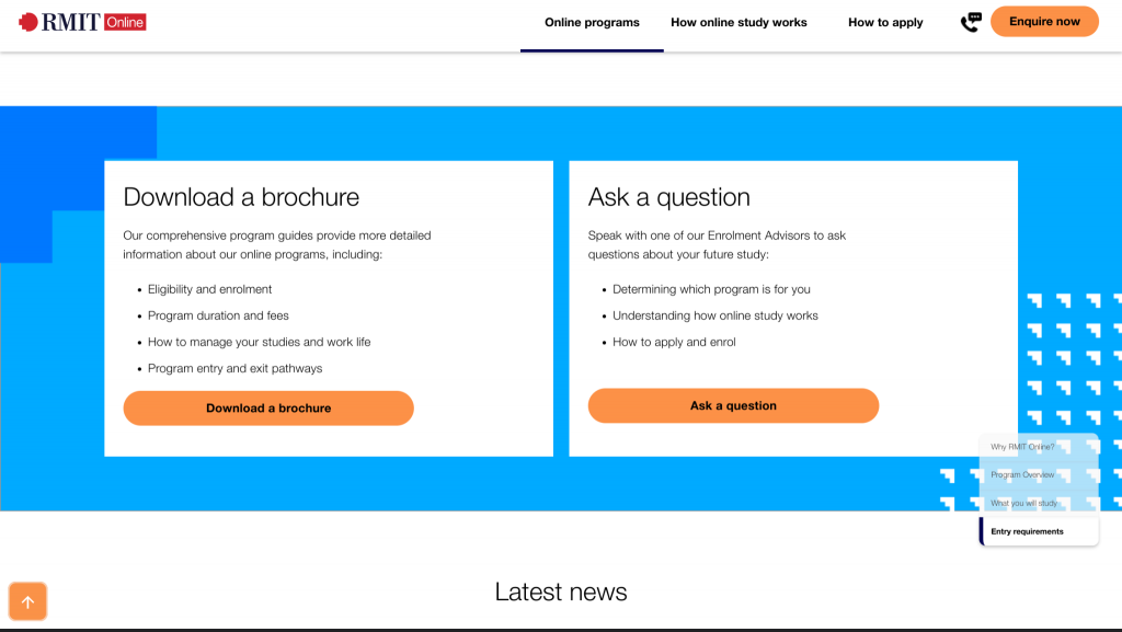
Take a look at how RMIT Online, an online university based out of Australia, incorporates strong CTAs on their landing page for their digital marketing leadership program.
Notice how a viewer has two options: they can download a brochure or contact RMIT to ask a question. Offering these two different CTAs is a great strategy because it targets two different types of people. People interested in the brochure are probably a bit more on the fence about the next step in their education compared to people ready to call to ask questions about the program. Having multiple CTAs displayed in bold orange buttons is also likely to help them boost their conversion rate here, as they really stand out.
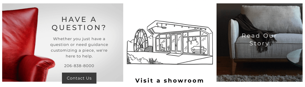
You don’t have to resort to using bright and bold colors if that doesn’t fit with your brand, though. For example, Kasala Living, a furniture retailer based out of Seattle, takes a more subtle approach on their dining room furniture page.
Similar to our previous example, notice how a visitor has three options, depending on where they are in the customer journey. People interested in learning more about the company can click to read their story, people ready to check out the furniture in person can find the nearest showroom, and people who need additional information about customization or product details can call for help. These CTAs are clear, concise, and target several different types of customers, making it great for boosting conversions.
Consider dedicating a specific part of your web page to your CTAs. On each page, consider what it is that you want a customer to do when they read your page. And you should also use relevant imagery or bright colors to attract attention to your CTAs to help make them stand out.
Include positive customer reviews wherever appropriate
Here’s a fun fact: 72% of consumers won’t take any buying actions until they have read reviews (g2). So, if you include positive customer reviews throughout your website, they can help boost your conversions.
There are lots of tactics you can use to get your customers’ feedback. Conducting surveys with people who have made purchases with you, interviewing clients, or combing through your social media comments and Google reviews are great places to start.
You’ll also need to consider how you’re going to incorporate your customer reviews into the design of your website. You have several different options, including using lengthy written reviews, carousels of star ratings, or even videos of your customers who are happy to share their experiences.
Here are a few examples of businesses that do a great job of incorporating reviews into their website designs. They’re sure to give you plenty of inspiration.
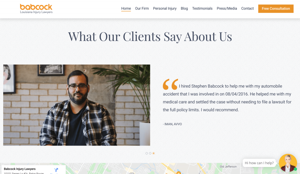
For instance, Babcock Injury Lawyers is a personal injury law firm based out of Louisiana, which will need to build trust with website visitors if they want them to become clients.
The reviews on their homepage really help with this. Towards the bottom of the page, you can see a carousel of reviews from clients that praise the helpfulness of Babcock and talk about how pleased they were with the outcome of their cases. The images of the clients help humanize the reviews, as well. Displaying their positive reviews like this could go a long way towards helping the company to attract more clients.
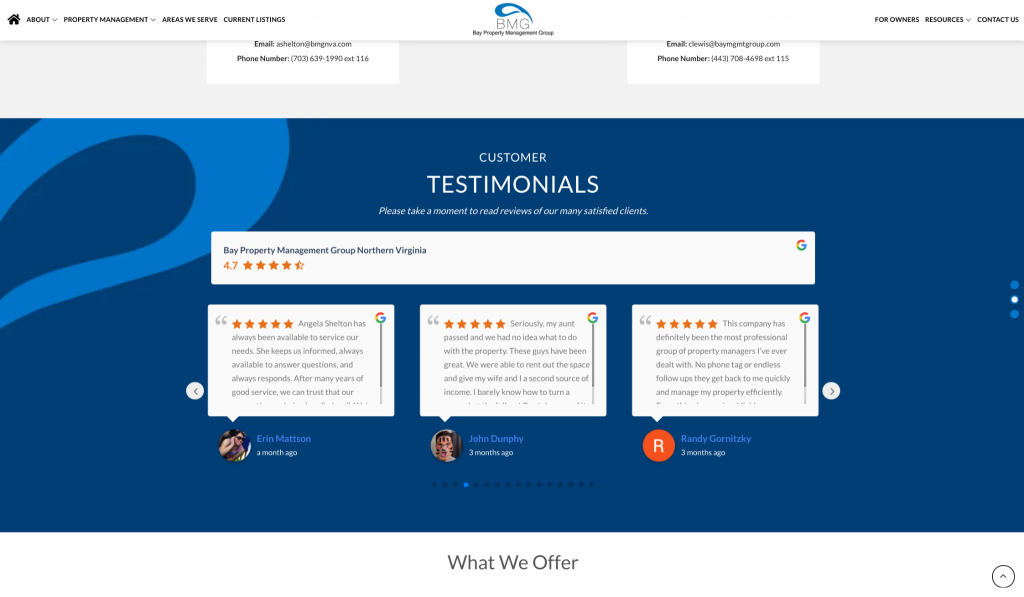
Bay Property Management Group, a real estate management company with multiple locations across the East Coast, incorporates reviews into their web design effectively as well. Let’s take a look at their Northern Virginia page as an example.
Because they serve multiple states and cities, they incorporate local reviews into each of their individual location pages. This is much more helpful to the viewer than a generic set of reviews for the company as a whole would be. People want to know that they will be taken care of, and local reviews help give the prospective clients this assurance, making it great for increasing conversions. It’s helpful for a client to know that people in their local area have enjoyed using the company’s services!
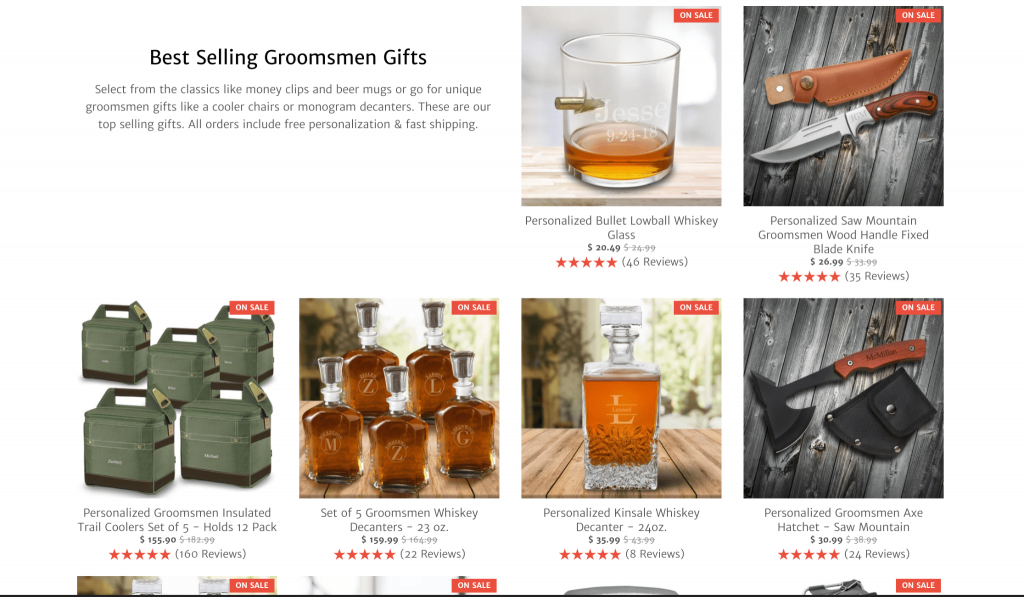
Finally, GroomsShop, an online groomsmens’ gift retailer, showcases reviews of their products on their homepage and category pages. By including star ratings, they’re able to include reviews of each and every product without taking up too much space. Star ratings like this can work especially well for product-based businesses, so it’s worth considering displaying them on your ecommerce pages. They give a very clear indication that your products are of a very high quality.
Always use high-quality images that will excite your customers
Using high-quality images on your website is a great way to get people excited about your products or services. Additionally, images of your team members can humanize your business and make you feel more relatable to the viewer, which will help increase your conversions as you build up a sense of trust.
Here are a few different ways you can use high-quality images to get people excited about using your products:
- Show people like them using your products or services
- Take pictures of your products or services in action, highlighting their best features
- Use images that humanize your business. You can include images of your staff on a ‘meet the team’ page, and scatter them throughout your site to put some faces to your company
Let’s take a look at some sites that are already doing a great job of using imagery to get their prospective customers excited and make more sales.
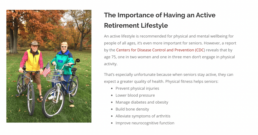
Take a look at how Copeland Oaks, a retirement community in Ohio, uses imagery on their independent living facilities page to show potential customers what kind of life they could soon be living.
Deciding to move to a retirement community (or moving a family member into one) can be a stressful endeavor; you want to be sure that it’s a safe and enjoyable place to live. Their imagery of their residents helps to show how friendly and fun Copeland is. Across their website, they showcase residents enjoying the company of others, engaging in the community, and more. This humanizes Copeland Oaks and could go a long way towards attracting more clients. If you provide similar services, think about what images you can use to show that your business is friendly, approachable, and helpful.
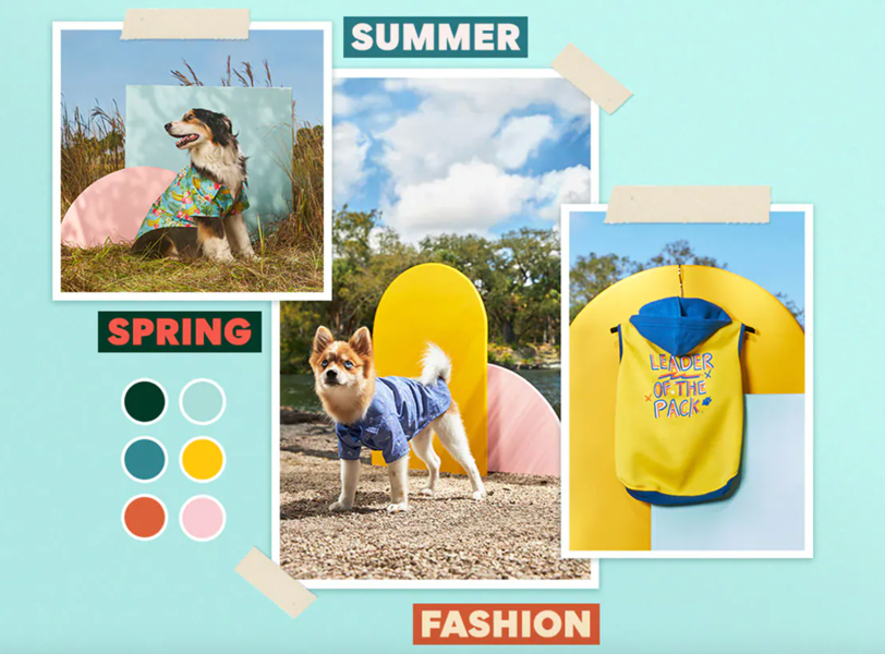
Similarly, Chewy, an online pet store, excites their customers about their products using their imagery. In their blog post on cute dog and cat clothes for the summer, they have adorable pictures of pets modeling their outfits. This will help customers to imagine what their animals would look like wearing these fun clothes, which encourages them to make a purchase.
Think about how you can show your products and services in the best light possible through your imagery, whether it’s by modeling your products, showing off your customers, or using the right stock imagery.
Make sure your site’s navigation is easy to use
If you want to boost your search engine optimization (SEO) and raise your conversion rate, you need to ensure that your website provides a positive user experience (UX). One of the best ways you can do this is by having an effective and clean navigation.
If people don’t know how to get around your website, they’re not going to want to stick around to make a purchase. This will signal to search engines that your website provides a bad UX, and this could have a negative impact on your search engine rankings.
You can start by conducting a test with a third party, like a professional or a staff member, to get their opinion on how easy your site is to navigate. Then, make a note of any areas that need improvement.
GlooMaps is a good free tool that can help you build a sitemap — having a clear visualization of how your website is planned out can help you see where your navigation might get confusing and how to improve it.
As you map out your site, consider flattening out the structure to ensure it’s incredibly difficult to get lost when browsing. Essentially, you want to limit the number of clicks it will take for people to get from one page they’re interested in to another. Once you’ve mapped everything out, your sitemap should look something like the below.
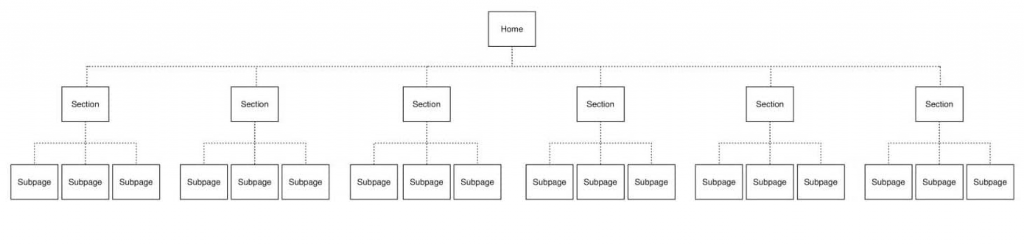
As you can see, there’s a minimal number of clicks needed to access any page. As a result, people will find it much easier to locate the information or products they need and will be much more likely to make a purchase.
Ensure your site displays properly on all devices
As of February 2021, nearly 56% of all website traffic comes from a mobile device (Oberlo). This means that your mobile website is even more important than your desktop site. Additionally, Google recently implemented their mobile first index, which means that, if your content is only viewable on the desktop version of your site, it will really struggle to rank well. If you don’t create a user-friendly mobile website, you could miss out on a huge number of customers who want to visit your site from their mobile devices.
If you’re not sure where to start with your mobile web design, don’t worry — there are plenty of guides out there that can help you dig into the code and make it perfect. Take a look at this free course from Google on the fundamentals of responsive web design for more help.
Summary
Boosting your website conversions can seem like a daunting task. But, by making some tweaks to your website design, you can make a lot of progress. Let’s recap how you can design your website to boost conversions. You should:
- Have stand-out CTAs
- Include customer reviews
- Use great imagery
- Have an easy-to-use site navigation
- Build a website that’s responsive on all devices
You might have your work cut out for you, but it’s worth making the necessary tweaks. Get to it!
Author bio & headshot:
Alex Ratynski is a Content Strategist at Loganix, an SEO fulfillment partner that works with agencies and marketers. The company focuses on helping businesses to improve their online visibility, so they can grow and reach their goals. If you enjoyed this article, visit the Loganix blog for more expert advice.