
As a website owner, you want to ensure that you’re doing everything you can to ensure that you’re getting the results you want. And the right website design can help you make more sales, get more newsletter sign-ups, and more.
In this article, we’re going to outline how you can ensure that the calls to action, or CTAs, on your website get results. A CTA is a word or phrase, often on a button, that tells a customer what to do next. They give people an extra push in the right direction and help ensure conversions!
Let’s take a look at a few different ways you can ensure that the CTAs on your website get results.
Make sure they have a bold design so they can’t be missed
The design of your CTAs is just as important as the wording — you don’t want your CTAs to blend in, or readers might not spot them. So, you need to put some thought into making them stand out! If you can help guide your website visitors’ eyes to them, this will help ensure clicks and conversions.
There are a lot of different ways you can help ensure that your CTAs stand out. Here are just a few tips:
- Use contrasting colors
- Experiment with button shapes
- Try out different placements on your website
Let’s take a look at a few different examples of solid CTA designs for inspiration.
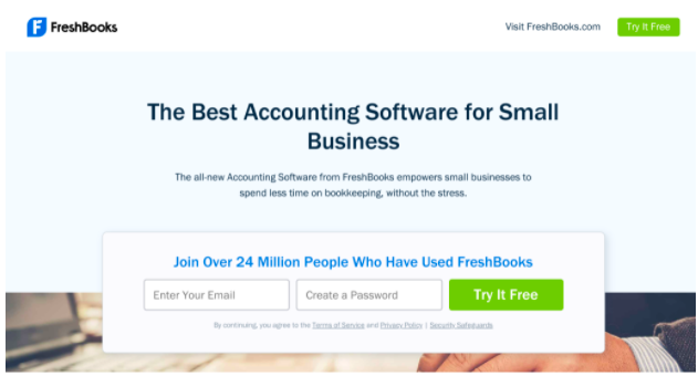
FreshBooks, an online accounting software service, has a very strong CTA design on its service page. As you can see in the image above, there are two CTAs that stand out, both of which say “Try It Free”. The CTAs are separated from the rest of the page by a bright green button to ensure they won’t go unnoticed
Having CTAs that stand out like this is a great way to help ensure people sign up or make a purchase. On your website, don’t be afraid to repeat your CTAs in different areas of your website in a similar manner to FreshBooks. Doing so can help get more eyes on your CTAs, helping increase the likelihood of clicks and conversions.
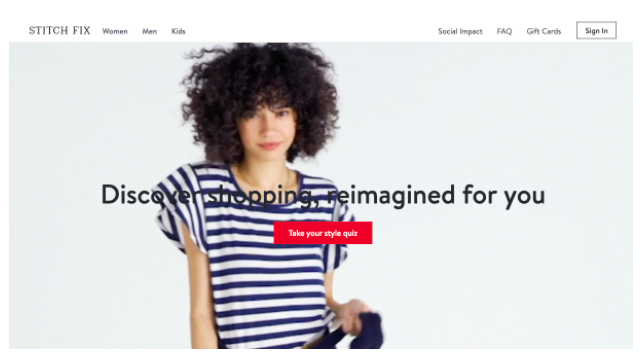
Stitch Fix, an online clothing subscription service, has a well-designed CTA right on their homepage. As you can see in the image above, there is a bright red CTA at the center of their hero video, which rotates through different people wearing stylish clothing. The CTA here says, “Take your style quiz.” The CTA pairs well with the video; it indicates that Stitch Fix has styling options for all different types of people. This can get people excited about their wardrobe selection from Stitch Fix and encourage them to click!
On your website, consider the surrounding area of your CTA — how is it complemented by any images, video, or supporting copy? Be sure that these areas of your website work with the CTA to encourage people to click.
Provide a call to action to suit everyone
Different people who visit your website will be at different stages of their buying journey and have different needs. This means that you need to design your CTAs with the different stages of the buying journey in mind. For instance, you might want to tell one person to make a purchase, but encourage another to give you a call to find out more information. It’s useful to include multiple CTAs on the same page to account for this!
Let’s take a look at a few examples of websites that provide multiple CTAs to target different customers for inspiration.
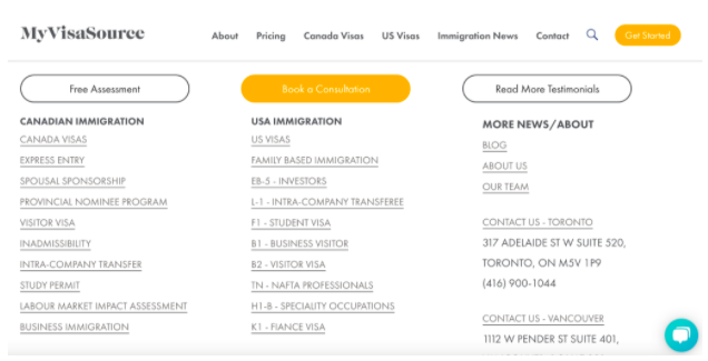
My Visa Source, an immigration law firm based out of Canada, provides a variety of CTAs on their homepage. If you scroll down to the bottom of the page, you’ll see a spot where website visitors can click one of their CTAs: “Book a Consultation” or “Read More Testimonials.”
The CTAs here are great for individuals who aren’t totally sure whether or not they want to give their business to My Visa Source, and all of the CTAs help website visitors with different needs. If they’re ready to speak to someone at My Visa Source for more information, they can book a consultation. If they’re not sure yet and want to read more about their past results, they can read more testimonials. On your website, include CTAs that target different customers. Doing this on your website can help ensure that everyone’s individual needs are met — this will help you build trust among your prospective customers, thus ensuring you secure more conversions.
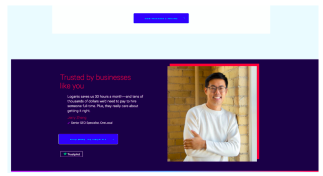
Loganix does something similar on their service page for monthly managed SEO packages.
As they scroll through the page, a website visitor will come across a variety of CTAs that lead them to package specifications, testimonials, and more. These CTAs include “Get Started,” “Read More Testimonials,” and “View Packages & Pricing.” This gives a variety of website visitors a specific place to click, whether they’re ready to buy or still want more information.
On your service pages, create CTAs that direct visitors to different parts of your website to make purchases, learn more, or get in touch. This will help you hit the needs of a variety of website visitors and improve your conversion rate.
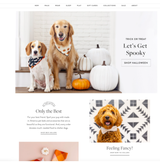
The Foggy Dog, an online dog accessory company, does something similar on their homepage.
As you can see in the image above, website visitors scrolling through the page have a variety of CTAs to choose from based on their product preferences. The Foggy Dog highlights their Halloween collection, their best sellers, their bow tie collars, and more. This helps ensure that, no matter what style of product the visitor is going for, they can easily get access to it from here.
If you run a product-based business, include CTAs that direct a customer to different category pages on your website — this will help ensure that people can find the right products quickly and easily, improving your conversion rate.
If you’re offering something for free, shout about it
Who doesn’t like free stuff? If you’re creating a CTA related to something that won’t require the reader to spend any money with you, make this very clear! This can work for things like free templates, free trials, free consultations, and the like. Offering something for free is also a great marketing tactic in general; it shows people what you can do and can build customer loyalty, thus increasing the chances of someone spending money with you in the future.
Let’s take a look at a few examples of businesses that showcase their free services with strong CTAs.
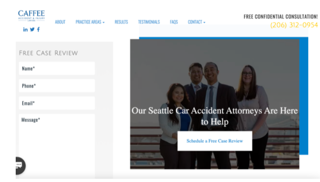
Caffee Accident & Injury Lawyers, a personal injury law firm based in Seattle, shouts about their free services on their service page for their car accident attorney services. At the bottom of the page, there is a CTA that highlights Caffee Accident & Injury Lawyers’ free case review service that states, “Schedule a Free Case Review.” This tells the website visitor that they don’t need to spend money in order to get expert advice on their case. Because there’s nothing to lose, website visitors are encouraged to click. This can help improve conversions and get results!
On your website, be sure to highlight that you have free services wherever you can. Offering something for free can be the final push to secure conversions.

Netflix, a movie and TV streaming service, does something a bit different on their homepage. If a website visitor does not have an account or is not logged in, the image above is what they see. There is a clear CTA that tells a visitor where to go if they want to sign up, and it clearly acknowledges that they offer a free trial. People interested in Netflix’s services who visit the website might be more willing to sign up simply because the company offers a free trial. This can help increase conversions!
On your website, be sure that, if you offer free trials or consultations, they’re highlighted front-and-center with a relevant CTA. This will convince more people to click your CTAs and take your desired action, thus improving your conversion rate and your bottom line.
Inject some personality into your calls to action
You want to be sure that your prospective customers really engage with your CTAs — injecting some of your brand personality into them can really help with this.
Having a strong brand voice is a vital part of growing your business. When trying to identify yours, think about who your customers are and how they like to be spoken to. Do they expect you to be strictly professional? Would they appreciate a sense of humor? How do other businesses in your niche address their customers? Answering these types of questions will help you discover your brand voice.
You can use your CTAs to show off your brand voice and personality. Let’s take a look at a few examples of businesses that implement this strategy well.
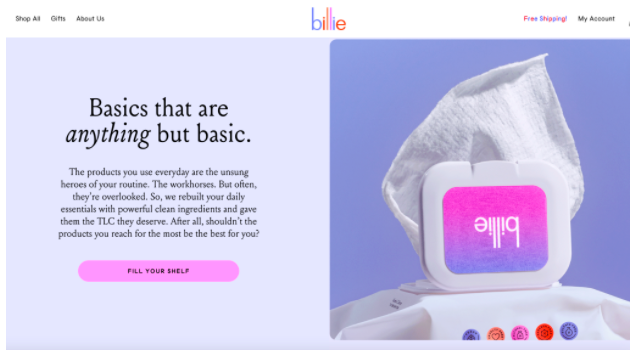
Billie, an online razor subscription service, showcases their personality through their homepage’s CTAs. In the image above, the CTA says “Fill Your Shelf.” This is more fun than something like “Shop Now” or “Browse the Collection.”
The copy here indicates that Billie wants to become a part of your everyday beauty regimen and that they have a variety of products that can help them to do so. By showing off their personality a little, Billie can build a relationship with their website visitors and help ensure that they get more conversions through their website.
For your CTAs, use the copy to show off your brand personality. Doing so can give your website visitors a better idea of what they can expect from your business, encouraging more conversions.
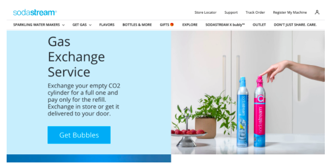
SodaStream, a home drinks carbonation equipment company, does something similar on their homepage. In the image above, you can see that SodaStream has a gas exchange service; customers can swap their empty canisters of CO2 for a full one and get a discount. The CTA here is clever: “Get Bubbles”. It’s fun, clever, and tells the reader exactly what they’re going to get after clicking the CTA: more bubbles for their drinks!
On your website, don’t be afraid to have fun with your copy. Playing with phrasing or infusing your personality into your CTAs, making them funny or charming, will encourage people to click.
Create a sense of urgency with your calls to action
Creating a sense of urgency can make consumers feel like they’ll miss out on your services or deals if they don’t act immediately. This can lead to more people taking the action you’re looking for right away.
There are a lot of different ways that you can incorporate urgency into your CTAs. Even just adding the word “now” at the end of a CTA can make a world of difference — “sign up” and “sign up now” have two slightly different meanings — the added word “now” implies urgency. You can also add timers to any supporting copy about money-saving deals to show customers that your offers won’t last forever.
Let’s take a look at a few examples of businesses that incorporate urgency into their CTAs well for inspiration.

American International University, a higher education institution based out of Kuwait, has a CTA that gives off a sense of urgency on their academic programs page.
The CTA, which says “Apply Today”, indicates to prospective students that they only have a limited amount of time to enroll at AIU for the upcoming semester — the sooner the better! This encourages prospective students to start the application process and should boost AIU’s conversion rate.
If you offer time-sensitive services or deals, use CTAs that indicate this. It’s a strategy that will stir up a sense of urgency in your website visitors and increase your conversion rate.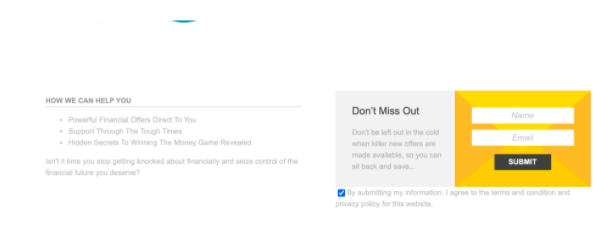
ReallyBadCreditOffers.com, a financial reference website, also has a great CTA right on their homepage that incorporates urgency well. At the bottom of their page, they have a CTA alongside their contact form that says, “Don’t Miss Out”. This tells website visitors that other people are getting in on the tips and services from ReallyBadCreditOffers.com. If website visitors don’t supply their contact information, they could be missing out! This showcases urgency and encourages people to click.
On your website, try to convey to your customers that other people are using your services and loving them — this will tap into their sense of FOMO and encourage them to click.
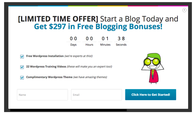
Lastly, Blogging.org, an online blogging guide, has a pop-up with a CTA that creates a great sense of urgency. As you can see, the pop-up has a timer that outlines just how much time a website visitor has left to get in on their current deal. The CTA here says “Click Here to Get Started” and, by attaching the CTA to a timer, Blogging.org encourages people to click right now.
On your website, think about how you can incorporate a timer near your CTAs if they are based on a time-limited sale or a countdown to an event or webinar. The ticking clock will help encourage people to quickly make a decision.
Summary
Your CTAs are some of the most important elements of your website. They can direct customers to where you want them to go, showcase your brand personality, and encourage sales! In this article, we outlined how you can ensure your CTAs get results, including by stirring up a sense of urgency, creating a bold design, and incorporating your brand personality.
Need more help running your website? Check out the InkHive blog. They can help you generate more leads, create logos, conduct keyword research, and so much more.
—
Author bio & headshot:
Alex Ratynski is the founder of Ratynski Digital, an online marketing consultancy that focuses on helping small and medium-sized businesses achieve their goals. He set up his company after working as a local SEO director for a dental marketing agency, where he helped to turn clients’ ventures into thriving multi-million dollar businesses. He spends most hours strategizing SEO for his clients.